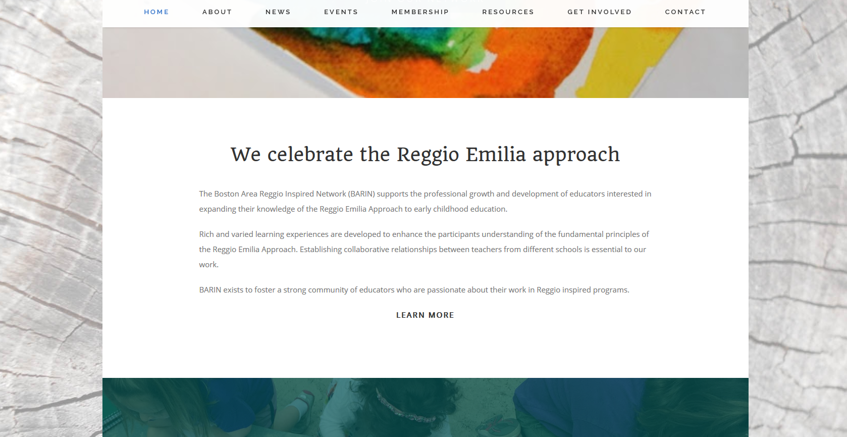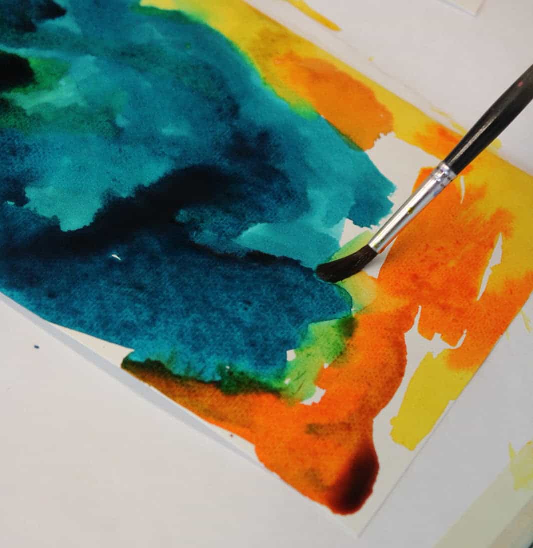
The group supplied a bunch of photos from their classrooms and events for my use, and I was inspired by the following painting from a preschool classroom. I found myself consistently returning to this photo, so I decided to pull colors from it for the logo.

I decided on a beautiful, clean, open-source font Quando, found on Google Fonts for the logo and header text in the site design. Going with an open-source font allows for free usage and seamless embedding across devices and browsers. The web site will always look consistent and sharp no matter what their visitor is using.
This font also pairs well with Open Sans, which I already decided to use in body and menus of the site design. It was important to find a font that paid homage to Boston (think Red Sox “B”) and Italy (where the Reggio Emilia philosophy was born) with a classicly, modern European feel. I needed the font to speak to me, and this one did.
An interesting tidbit: the talented font designer, Joana Correia, is a woman from Portugal. I love her work. This particular font of hers seems to work well paired together with the creative, colorful swirl portion of the logo.
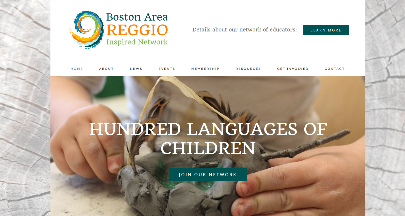
The director requested natural materials and photos be used throughout the site to conform with the Reggio philosophy. She also wants a lot of white space, but with colorful accent photos to feature, thus the clean header and navigation menu. A colorful logo can be used on a site design with a lot of white space. If the header were any other color this logo would most likely be too busy.
It works well on a white background. I found a great royalty-free trunk stump to use as texture for the main background after some layer modifying and washout. I pulled two primary colors #015353, #ff7f00 and an alternate #7bbb4d for accent use on buttons and image overlays throughout the site.
